

Hello yes you did notice there’s a new design! Alex and I have been working on it for several months now. Alex did the design, and I wrote the code.
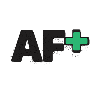
New logo
Alex redesigned the logo!
The old logo
The new logo
New header
The header was completely redesigned and overhauled. We realized the about us “star” menu was confusing, and a bunch of our great content was buried several levels deep in the old menu, and we wanted to make it easier for y’all to find what you’re looking for.
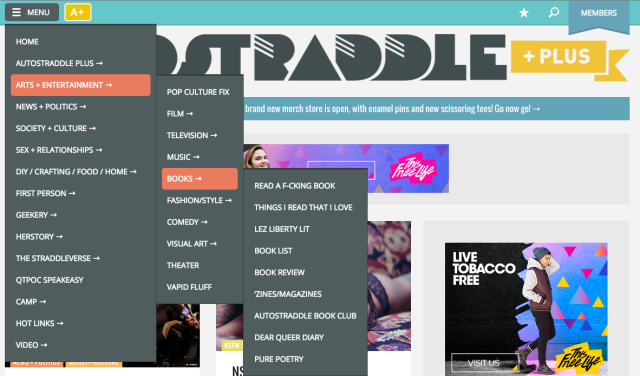
The old menu on desktop
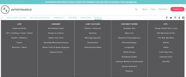
The new menu on desktop
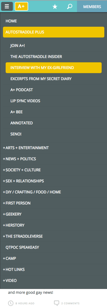
The old menu on mobile
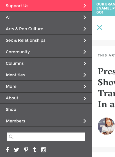
The new menu on mobile
New Fonts
We changed the main fonts from Oswald & Open Sans to Vesper Libre* Merriweather & Montserrat.
* We just swapped it out for Merriweather which is hopefully easier to read! Please let us know if it’s better.
Wider
The site on desktop now maxes out at 1300px wide, instead of 1154px like it did before.
Announcement Bar
The announcement bar is at the top of the page now and dismissible. You can click the X and it’ll go away, and not come back until we change what we want to let you know about!
Feedback?
Do you have thoughts or feelings about the redesign? Bugs in your browser? Please let us know in the comments below! Thank you!
I like the layout!
The new font makes everyone sound different though, so that will take some getting used to…
hahaha totally I think the new fonts feel like everybody is speaking with slightly clearer diction whereas the old one felt a little more mumbley pajamapants and this is more a ‘I have put on a bra and I remember SAT words’ which is fine. This new font will probably eventually feel more familiar and will just wind up wearing it like the decaying majesty of an unkempt hotel from the 20s with Art Deco architecture and beautiful bones but comfy but slightly frowsy bedspreads.
Your last sentence was one of the most relieving things I’ve read all day.
oh good!
I know digital media is not really likely to have the same opportunity to age in the same way of old fancy hotels, but AS does feel like nice sheets worn soft and familiar, you know?
It works great on Safari now congrats ! Love the new look (will miss the old logo but the new one looks great!).
One thing I’m missing = on mobile devices, I used to have the top ribbon reappear if I scrolled up juuuust a bit, which was SUPER convenient to return to the main page after having commented on an article (which brings you to the bottom of the page). Now it’s gone and I have to scroll all the way up to click on the home logo
WELL NEVER MIND there’s a “back to top” button right underneath me. IT’S BEEN THERE THE WHOLE TIME hasn’t it ?
*cue scary music*
Well no ok I AM missing the top ribbon being present to more easily get back to the main page. If you’re in the middle of the comment section and there’s a lot of comment you have to scroll foreveeeeeer to find your way back !
Agreed!
Hey @clochou, it’s not going to help on mobile, but for my desktop browsing I just found a Chrome extension that sends you back to top with a floating button from wherever you were, and as I am kind of a heavy user who was used to clicking on the ribbon -> “Home” from the middle of the comments a LOT, this is kind of doing the trick…
It’s called “Scroll to Top Button,” if you search the Chrome extensions you should find it.
The new look is okay, I guess. Never been a big fan of change.
Not that I have vision problems, but the font isn’t as good. Was better before. =)
I like it! It all looks very smooth and well put together. Normally it takes me a while to adjust to big website design changes, but everything is organized really nicely. I especially like the new menu options.
Also there’s an “OUR BEST WORK” tab THIS IS GREAT.
ALSO I LOVE THE NEW FONTS OKAY BYE.
I love it! Also, I’m not sure how it was before, but the responsive animations are v nice.
Wait what responsive animations ? are you guys getting animations ?!
yup! have you tried on mobile, Chloe?
I love the new menu: definitely easier to navigate! And also love the new logo. The last one was rad, but this is very clean and keeps the triangles <3.
Also not a fan of the fonts, seem harder to read to me. But maybe just tired eyes at the end of a long day and not used to change.
Looks perfect on safari, on chome the menu/just below it is a bit odd:
maybe the latent reason I don’t like the font is the 3 doesn’t make a good heart. :p also meant chrome not chome, as I bet you guessed.
Hello! What version of Chrome are you on, and what OS? Thank you!
Hello, Cee!
Chrome Version 50.0.2661.102 (64-bit)
OS X Yosemite Version 10.10.5
Thank you! I’ll take a look
since I posted the screenshot, the big grey line is gone and the only problem I see now is the thin line under the menu not being solid. :)
Hi Rachel! I just pushed a code update – can you check to see if this underline bug is fixed for you? Thank you!
Hello again Cee,
It still has a gap under More for the moment.
Thanks so much!
Gah. Okay try now? Thanks for your testing help :)
looks perfect!
I’ve only seen it on mobile but so far I think this website is really, really, ridiculously good-looking, just like all of you.
It works great on my mobile but on my laptop I had a large white space down the middle and only one column of articles all to the left instead of two columns filling the whole space. This just me? I tried zooming in and out. Not sure how else I could rejig that.
I used to get that with the old layout too, and then it would suddenly jump to having the right number of columns after a little bit? It’s still the case with the new layout though, yeah.
Yes me too! I was also wondering about this.
oh and I should have also said I’m using Firefox on Ubuntu 14.04
I have the same issue.
If I shrink my browser window, It goes to two columns. Which doesn’t make much sense to me.
Firefox. Mac OS 10.6.
Same here – one column on my (admittedly large) monitor, two columns if I shrink the browser window.
Firefox 46.0.1 running in Windows 10.
no it looks like two giant columns for me too with lots of white space in the middle!
Same here, and I’m on Firefox.
Hi all this should be fixed now!
Thanks for fixing this! I was having the same problem in Firefox on a Mac running 10.7. Seeing so much white space was disconcerting.
As of Tuesday afternoon this is still the same for me
I really like the new header, it will be much easier than trying to search for what I’m looking for. Not sure about the font and new logo. It feels like there’s less weight to it.
Maybe a potential bug? In Firefox, articles only show up in one column but in Chrome, they show up in two (which I prefer). I’m not sure if that’s a me thing or a Firefox in general thing.
Ooo I use Firefox, I think its a Firefox thing.
What version of FF are you both using? And are you on Mac or Windows or ? Thank you!
Windows and 46.0.1 apparently.
Hi I think this bug has been fixed. Can you confirm? You’ll probably need to shift+reload to see. Thank you!
Thank you for the fix, all the most popular browsers are now showing the 2 columns
Fixed for me, too! Thanks!
Overall I like it a lot. I like that it’s wider and uses the screen better. The links at the top seem clearer too. Not sure I’m a fan of changing the whole look of the site when the old look was really cool and more colorful. But I’m sure I’ll get used to this. If I had a complaint it’s that you guys sprung this on us without warning or feedback.
also great work making SUPPORT US very visible, I remember looking for a link once to try to make a donation and eventually giving up.
(it was only going to be a few dollars to test that my CC was working, not the biggest loss ever, but still)
Also are editable comments just going to be a pipe dream forever? That’s one thing we keep asking for every time a site change is talked about.
I read that as “edible comments” and I thought “wait is this yet another thing from A-camp that I’m gonna miss ?!”
cee has answered this question before many times! maybe she will answer it again today.
I remember someone saying the last time the site changed that being able to edit comments was never discussed as part of the job, but I figured that if you were redoing the site it might be possible.
I don’t remember what the reason was but it was definitely more than just “not part of the job” – there was a valid reason that it wasn’t doable. (I was one of the people clamoring for editable comments before too.)
There might well be a reason it’s not an easy or simple thing to implement, I have no idea about these things. LOL But I was definitely told last time that it wasn’t discussed as part of the designers job.
FUCK YESSSSS THE NEW HEADER
I like it. Definitely easier to navigate
The new layout looks great!!
I think it will grow on me, although it does look a bit more professional I kind of miss the old aesthetic. I won’t even be able to remember what the old site looked like in a month though.
Not sure if it’s my internet but whatever should be in the top right on the side bar (presumably an ad?) is just showing up as a big grey square, regardless of the page I’m on. Everything else is loaded fine, and its the same on safari and chrome. And I’m not aware of any adblockers being on.
this happens to me a lot and I was told that it has to do with the company that manages the ads and sometimes they just don’t have ads that correspond or something like that. in any case, it’s happened to me for a while and probably isn’t the fault of the new layout. :)
only on autostraddle would I have bothered to complain about not being shown ads :p
On the mobile homepage I get the mobile header across the top and then under that the desktop header with all the options (a+, sex and relations etc). I don’t think that second one is meant to be there? Its not there one articles either, just the homepage.
Hi! Maybe you’re seeing a cached version and you need to refresh, or perhaps you’re seeing the featured image for this post? Unsure – maybe you can send a screenshot? Thanks!
Hahaha I’m seeing the featured image! Just worked that out myself by seeing it on desktop. That’s really made me giggle.
Lol I’m relieved I’m not the only one :p
I changed the featured image to a kitten! :)
Now I’m done picking holes in it, I just want to say I think it is far far better navigationwise. I miss a more colourful design but I do like the new logo.
I don’t like it because I am resistant to change and the reminder that nothing life is permanent.
I’ll probably get over it in 3 days.
More specifically, I think sans-serif font reads better on screens.
Here! here!
I agree about sans-serif!
Also about change, but what can you do.
Update: I got over it.
Thanks, Alex and Cee, for your hard work. It looks great.
Hi guys! Can’t really comment on a lot of it until I get more used to it. Change is so hard, you know ;). Thanks for all of your hard work on it!
Issues/questions thus far:
*how do I get to the My Activity page? Right now, from mobile, I’m having to click on Private Messages first, which doesn’t make much sense.
*top bar doesn’t show up when you scroll up a bit anymore, so much harder to switch what you’re doing on AS once you’re down in an article or the comments, as Chloe mentioned above.
You can get to the my activity page just like before – by clicking “members” > “my account” and then the activity tab on your profile page.
We’ll think about the header stickiness thing! Thank you!
There’s no Activity on the account page, tho???
I tend to be extremely change-averse when it comes to website designs, but in this case I like everything except the font, which makes me think I have suddenly developed blurry vision that only kicks in when I come to this particular site. Generally, the more curlicues, ornamental flourishes, and “thick and thin” variability of each letter, the harder it is to read. Sans serif is a girl’s best friend.
Also, I’ve been meaning to ask for a while: Is there a way to subscribe to a thread’s comments, so we can get notified of new ones even if we didn’t post a comment of our own? I forget to check back at all the threads I’m interested in, when I’ve been reading several. And I also think conversations that die off after a day or two might continue longer if there was a way to notify people that they were still active, or active again after a lull.
YES!!!!!!!!!!!!!!!!!!!!!! THIS!!!!!!!!!!!!!!!!!!! <3
I hate replying days later :/
I love it. My one comment is that I’ve always felt like the “read the entire article in one page” should be at the top of the article.
I second this!
I third!
One problem i just spotted: on mobile in main page if i try clicking on any option from the menu it selects the top article instead. I’m assuming this is a sensitivity issue ? If i zoom in it would probably work but it is a bit annoying :)
Nope just tried even zooming in i can’t click on the menu options it automatically takes me to the top article page
I’M AN IDIOT this is literally the picture of the post that I’ve been clicking on THE WHOLE TIME.
(I’m sat here laughing my ass off at my own stupidity).
I DID THIS TOO!
lol I also did this.
@clochou you are my favorite.
A www <3
Well, I feel silly now.
Same here!
I’m surprised! I think I’ll miss the colours, but it is very neat, aesthetically.
In terms of potential bug: On Chrome (with Windows 10 as the OS), the line under the menu is broken? Also the fonts for “Submit Your Comment” and the notification tick boxes are set on the old font.
I have to admit though that I think I share others’s opinions that the new fonts are a little harder on the eye for large sections of writing? I think it looks very neat for headers, but for text-text (to use the appropriate words), it feels slightly less accessible than a sans serif font?
(Also, the font for writing comments is different entirely? I don’t know if that’s intentional!)
The new menu organisation does seem much better though, and I know now autostraddle has an instagram page! I think the removable announcement is a good idea too, I kept thinking there was a new-new announcement, but it was only the old-new announcement a lot of the time.
Also, as someone used to the bizarre tumblr layout rollouts where everything would break in strange and bizarre ways and become unusable, congrats on everything changed that changed so seamlessly that we likely won’t notice to comment on because it works so well! (That compliment worked in my head! I hope it works outside of it too!)
New AS you look really cool I’m worried you’re going to find cooler friends but I can get used to it it’s fine I’m just a little insecure right now but we’re good we’re fine I like your hat.
don’t worry i have abandonment issues and would never leave you
OH THANK GOD I was worried I would have to like, sing you Landslide on the ukulele to express my anxiety about being left behind.
BUILT MY LIFE AROUND YOU etc.
I was literally thinking yesterday how much I like the logo. Ah well. I’m sure this one will grow on me. And I’m sure you design people know more about what looks modern, so maybe this update will attract advertisers and sponsors and all that good stuff.
Will the old logo maybe stay in circulation for like, merchandise or anything?
I’m kinda neutral on it. It’s not that I dislike it, but some things look off: I’m not certain I’m seeing the new font correctly (it looks like Times New Roman to my uneducated eyes, with sans serif fonts on the reply/submit buttons and below this comment box), there’s a weird grey box in the top right corner which I think might be an ad even though I’m an A+ member, and the A+ yellow looks odd in the new design.
Here’s what I’m seeing: http://imgur.com/0WKoeLZ (The blocking extensions in the toolbar, Adblock and Ghostery, are off.)
An ad usually displays inside that box. For some reason you’re not getting one currently.
They’re not meant to show to A+ members, are they? Hm, I might have some hosts file blocking of doubleclick.net, actually.
I am not a fan on the new font but love everything else! I dunno, new font doesn’t feel as easy to read, as friendly (as a font could be?) and makes me feel like I’m reading something academic.
Same for me too!
On mobile I liked the new font, but on my desktop again I’m realising just how hard to read it is. Like, going blurry. I like the feel of the new font I think, I just am struggling to read it.
Agreed! It’s hardwe to read on the main site than mobile. Which whenever I want to really read an article I always go to my laptop instead of my phone
that’s funny; i feel the exact opposite. on mobile i found the new font excessively small, but it’s fine to me on my computer.
tho actually, either i’ve gotten used to it just that fast or it looks different than it did when i was first looking at it on mobile, because now it seems fine. who knows.
Oh – would love a link to the Comment Policy in the About section of the menu.
*That crookedy main font is so strange! It actually has me reading articles in Reader View to avoid it. Sans serif ftw online.
*Lovely having the menus current and therefore usable!
Thanks again! I know it’s not easy throwing up a redesign when people love a site like this one!
I think it will make me some time to adjust to it, specially the new logo, but it’s great the site is constantly improving.
My only suggestion would be to add a notification system in the members section. Like you see a dot or bell next to members section when you have a new friend requests or messages. Also, imho the old color scheme had a bit of warmth to it, while this, paired with the new logo has a bit of a clinical feel to it. Thank you!!
Yes! This and also when someone replies to your comment as well. And the edit button.
Also, I’m not really liking the font too much! It feels like a glassy clear shower door with water running down. I don’t know, it’s just a bit blurry.
The font face is fine, but I’m finding the color too light. It’s putting strain on my eyes and making me not want to read more than a paragraph or so.
I second this.
I like it!
THANK YOU HATTIE
I would love to see them keep some of the design elements of the old logo, like the A and triangles that are covered up. And make the top bar a bit larger to work better on larger displays, like a 24in desktop.
Regarding the new logo and header, my only concern is that they seem less colourful than the old logo and header? A little dryer, a little less friendly and cheerful than the old logo and header. But on the upside, it’s sleeker and more professional and more modern now, so if that’s what you were going for, you nailed it.
Also, I want to reiterate what others have said about the font. I really like the new font, because personally, I just like serif fonts MUCH more than sans-serif. But this new font reads a little blurry on my desktop (currently on my dad’s computer, which is Windows, running Firefox. Gotta check what it looks like on my Mac once I get home).
I really love the new font, but it’s true about serif fonts sometimes looking squished when rendered on some/many (?) screens. I call it the “Garamond problem,” since many things look beautiful in Garamond but I often have to make it 16pt or even 18pt to make it readable, depending on the reading situation. Maybe if there were a switch/button which would render pages in Avenir or some other clean, readable font with a name starting with “A”.
PS: I hate Helvetica in all its multifold forms. :-)
” I just like serif fonts MUCH more than sans-serif.”
Accessibility standards call for the use of sans serif. This is not just an aesthetic preference, it’s an accessibility issue.
I’m loving the new menu! So much cleaner and more accessible. The only thing I will say is that the fonts you’re using are coming up really badly for me (if it helps, Windows 10, latest build of Firefox – oh and I just tried it in Edge and it looks the same). I’ve included a couple of screen-shots of how they are rendering for me.
In their current state it’s fairly unreadable due to how rough the edges of the letters appear. The old font was perfect, and didn’t distort if zoomed in on phones/tablets.
Thanks for the screenshot – looking into this now.
Echoing everyone who isn’t keen on the font. Would definitely please prefer a sans-serif font. Much easier on my eyes.
Everything else however is BEAUTIFUL! V minimalistic and sophisticated. Nice work Cee/Riese.
Looks good! On Chrome (for me at least) the page seems to be too close to the left edge of the screen, but it looks a bunch better if I zoom out to 90%.
Hello Owl!
1. Do you mind sending a screenshot? I’d like to see what you’re seeing.
2. This was never a feature – refreshing will always give you a new page.
3. Sorry! Hopefully after a few days it’ll be less dizzying!
Like someone said before about the font, there isn’t much contrast in how the site looks over all. I wish the font were a bit darker and the blue and yellow contrast colors could be darker. Its hard to read the white text in the colored boxes on more white space. Its not very accessible.
Besides that, I’m liking it over all. Since the last redesign I’ve had my settings changed to keep the site at 75% zoom because everything was too wide. Now everything fits the page on my screen and I can have it the default zoom. That’s just one more change i have to get used to, things are pretty different zoomed in properly.
Actually not so much the white font in the colored boxes, those have a decent amount of contrast. I meant to say the light blue font that is only against white background. I wish that blue were darker or bolder font
Welp. Now that you have decided to make Autostraddle even *look* like clean, professional perfection, you’ve opened up the door for me to do the opposite thing and become your direct competitor. First, I’m going to design a site that looks like the charred remains of an abandoned Lisa Frank factory, 80’s neon haphazardly splattered everywhere. Then I’m gonna make it so ads pop up full screen every 15 seconds and every time you read 3 sentences, you get another inline ad that tells you to keep scrolling. Plus I’ll let lesbian TV shows pay me to write good stuff about them. THEN i’m going to hire and editor in chief who hates her readers, throws her writers under the bus on social media, only wants to be EIC so she can starfuck celebs and promote her girlfriend’s crap. She’ll have to publish everything that comes into her inbox without reading it — but here’s the kicker: she won’t want to read it! The EIC of my lesbian Lisa Frank garbage factory isn’t going to give a fuuuuck about my website. Enjoy the success of this redesign … while you can.
Damn, the website I described already exists apparently. :(
This is some top level shade. ;)
comment award??
Is that you, Trish?
PD: Comment award
I am so glad that you posted this!!
WOW! My first thought was “everything is super disorienting and man do I hate change”… So I didn’t want to chime in until I poked around the website a bit and got more comfortable with it.
Now that I’ve done that, I have to agree with others about the font choice. I find it significantly less readable than what was there before.
I love the new menu at the top of the page (I found the old system difficult to navigate), and I’m neutral (waaaah! I don’t like change!) about the new wider format.
The thing that is really sad for me is the loss of color (both in the logo and the whole top menu), I think the new set up is “sleeker” and “neater”, but it also feels “colder” and less personable somehow. It feels more corporate, and significantly less welcoming to me.
I haven’t encountered any major bugs.
That’s all the feedback I can think of for right now.
I’m sure this took A LOT A LOT A LOT of work! So congratulations on getting the damn thing done!
I second absolutely all of this.
Woooo a post by Cee!
I think I would like the new logo better if the letters were a little bigger in the circle
First Instagram, now Autostraddle- this is why I have trust issues!!!! Just kidding, I like the new layout, especially the bigger font and the new logo. Very slick.
+1 for the font being harder on my eyes.
Other than that I love everything about the new layout! I am all for the simplistic, clean look! <3
The menus are great, but I’d like to echo that I find the font really blurry and tiring/hard to read as well; not sure if “professional” is a good look for the site, but I am certainly in favour of keeping it stylish and distinctive. I do miss the colourful elements of the old design.
Also, not sure all the low contrast grey bits with my budget/low viewing angle monitor are helping: I get gamma shifts from the top to the bottom of the screen and that might be exacerbating the situation.
The new logo and font are brilliant; I liked the old one, but it was definitely feeling a little dated. The way the new logo displays at the bottom of the screen looks great, but it’s too small and seems too far to the left at the top.
Just to clarify, I meant the comment/article text font in the first paragraph and the logo/banner font in the last!
I like that the redesign looks sleeker but, as someone with an SpLD & chronic illnesses that affect my eyes, this is a lot harder to read as the font is less accessible (sans-serif is generally easier to read), the contrast isn’t very high & the writing is pretty small. Kinda bummed I’m gonna need to use accessibility software here now when I didn’t have to before.
I like the new logo.
This is beautiful! So new and shinny :)
Love the new menu system, much easier to find stuff now, and everything looks very clean. Going to echo all the comments about the font though – it’s just not as easy to read? Also having the header bar stay as you scroll down would be helpful. Great job though Cee and Alex, thanks for all your hard work!
Sorry for this but I’m not really a fan of the minimalist style, I’m not expecting a festival of colors but this looks too white/gray. I’m not using an ad-blocker and I’m praying for the ad to pop up in that gray space just to get a little color
[img]http://i.imgur.com/C9rcgE6.jpg[/img]
I say, two thumbs up! Thanks for all the hard work y’all are constantly putting into this site.
For the folks having a hard time with the change, I offer you the words or Garth Algar, in adjusting to the new Wayne’s World studio: “It’s like a new pair of underwear, at first its constrictive, but after a while it becomes a part of you!”
I think the new font is a bit gaudy, and I don’t love the new logo. However, I do like that AUTOSTRADDLE isn’t in such huge letters anymore.
But the new menus are great – and I am grateful for all the hard work that goes into keeping Autostraddle up and running.
Just popping in to second what many others have been saying – not a fan of the font change, particularly not for the comments. Also worried about accessibility issues.
I love everything else about this change, though! The heading in particular is phenomenal and has been working with no glitches for me (running Safari on Mac OS X 10.9.5). Congrats on the redesign and how successful all your work has been!
I like the overall layout a lot, I noticed the menu immediately!
I think the logo is way too small, and the article title fonts are waaay to big in comparison. Also I’m not crazy about the title font in general, but I think my biggest problem is how big it is compared to everything else. Also I would love a slightly darker font color for the articles.
I love it! Great redesign!
Love the new menu, the whole top-bar is much cleaner and takes up less space which is awesome, to say nothing of the amazingly better organization. Also like the new logo; again, nice and clean and it keeps those all-important triangles! Not sure about the font (in either direction), but then I don’t have a good side-by-side comparison, so it’ll take a while to analyze the new feel of it. All in all, very nice :)
Ok, at first I just stared at it and thought ‘no no no no’ because I don’t like change, but after looking at it a bit more I think I might already be in love with this new redesign. It looks so cool! Especially the new menu (on mobile).
And wow guys, so many feelings about fonts! I must say however that I agree a little bit with the complaints about it. It’s not as easier to read as it was before, but I think that in a couple of days we’ll get used to it.
Fellow designers and front end developer here and I must say I think you guys did a fantastic job. Feels like a breath of fresh air. Love the softness in the new logo design and how the Support Us button stands out as the only usage of that colour on the page.
Great work!
Love the new banner, & new fonts too. They look awesome on my ipad, & I’m picky about type as only ex-proofreaders can be. And yes, it’s def easier to navigate.
new header is great. I find the font in the article body and in the comments really hard to read though (especially in the comments). Firefox on a PC.
Besides the bug fixes, I do kinda love that we’re having a processing session for our feelings about the design changes on a queer lady website. Feels like some weird fractal of lesbianism. If only I had a graphic for that :D
Is there anyway to give use a dark theme as an option? Like my phone uses amoled display, & darker colors(specifically black) saves battery life, because technically that part of the display(where the black color) is either off or at a lower brightness. Samsung and a few others use this technology and it would be a nice bonus for some of us mobile/tablet users.
Oooooo, shiny. Great job!
I’m sure in a few weeks I’ll be all on board and I have no actual issue with it, but my whole life is changing write now and this pushed me over the edge this evening. Sigh, overly emotional self…
Me too, me too. It must be time for bed if I’m tearing up over something like this!
It’s just that I was coming to warm, cozy AS after a long day and then it was all sleek and professional and not a place that felt like home in the way I’m used to.
I’m sure it will again with a little time and poking around, though. Change is just a funny thing.
I like how the menus are more organized and easier to sort through.
I recently switched from safari to chrome because safari was being glitchy, so my first thought was “wow, things *really* look different in chrome!”
Hello! I just changed the font. I’m currently adjusting line-height and font sizes but I think it’s a lot easier to read. Hopefully that helps!
Thank you!
I love it!!!
Love this adjustment. Great work!
Just wanted to reiterate that I’m finding the new font much easier to read. Thanks again for being prompt and attentive!
I have chrome and it is really really messed up for me! All the menu options are on the side of the page and there is a blue A+ banner that follows me wherever I scroll and I can’t get rid of it. Is there a way I can fix this??
Hi you probably have a cache problem. Try holding down the shift button and refreshing – that may solve it.
You’re magic! Thank you!
I miss the pink and yellow colours but the new design looks more mainstream? I’m not sure how I feel about it but it might help autostraddle get funding! By looking more recogniseable as a news site? I don’t know :)
I like colours though. :)
Love, love, love the new site design. <3
Update: Just noticed that there’s a special tag/category for bisexuality. This is the most exciting thing. THE MOST EXCITING.
Wow yeah I forgot, I specially love the new Identities tab, and the link for Trans Women sent me over the moon. I already loved the site, but wow.
Spiffy! I like the font; it feels bigger in my eyeballs.
I like the menus changes and how my screen doesn’t jumble up on my phone now.
Not a fan of the font because of the triangles. It makes me think of the illumanti and this makes me think I need to stop reading stupid conspiracy theories.
Was the symbolism in the new AS design intentional? I mean I like that the font is very clean cut but still funky enough to be unique, just like the members on the site. The triangle is a strong shape too, which also has connections to the gay community. Oddly enough the triangle can symbolize: Gender
Creativity
Harmony
Proportion
Ascension
Manifestation
Illumination
Integration
Subjectivity
Culmination.
Don’t get me started on circles and unity. Over all the design is nice and friendly. Plus it looks like someone blowing a kiss.
Don’t mind me though. I am seeing connections everywhere after writing a literary analysis.
Switched from mobile to the computer just to see the desktop version properly! It looks great!
I really really like the new new font! Beautiful! Thank you for all your hard work Cee!!
You’re welcome!
A few possible bugs – the main page is displaying in two columns but when i click into a header (greatest work in the screenshot) it only displays as one and then there’s a space. Also the author photo circle thing isn’t showing up at the top of articles, there’s just a space, and only every few commenter photos are showing up, which is weird!

I’m using Chrome Version 50.0.2661.102 on windows 7 and my ad block and ghostery are off.
Think the new header and layout is brilliant – not sure about the new logo and it’s weird how different things ‘sound’ with the new font but I’m sure will get used to it. Mostly so glad that you have the money to do it and impressed at the smooth transition!
Hello! Thanks for the screenshot – is this still happening for you? I’m guessing its some sort of weird caching issue, with the images being broken too.
Hi Cee, sorry for slow reply. The articles showed up in two columns after I logged in but comment photos still hit and miss. But it’s much more likely to be my weird computer than the site I think!
Also using it on mobile now and the new layout is amazing – thanks so much for all your hard work.
Dear Autostraddle,
I love you but I hate this font. It makes me feel like I’m reading papers I wrote in college in12 pt Times New Roman. I mean, I’m sure I’ll adjust eventually, but right now it’s a little rough.
Sadly, but with love,
silvercake
I think I agree! I just love soft round fonts!
i like the new design and things!
a couple comments on it…
not a huge issue, but if you move the cursor slowly down from a menu topic, “Community” for example, there’s a point where the cursor falls off of the selection box, before it reaches the menu items, and the menu items close. you then have to try again, but move faster.
also, it would be super awesome amazing, if the header floated, and was always present, regardless of how far down you scrolled. like freezing the top cells in place in a spreadsheet.
Hi! What browser version and OS version are you using? Does this happen with just the “main” navigation or does it also happen with the upper “about” nav?
it only happens on the main nav, it does not occur on the about nav.
OS, Firefox, and Chrome version info:
https://s3.amazonaws.com/sleepymuse_share/os.png
https://s3.amazonaws.com/sleepymuse_share/firefox.png
https://s3.amazonaws.com/sleepymuse_share/chrome.png
Example Images:
https://s3.amazonaws.com/sleepymuse_share/firefox_image.png
https://s3.amazonaws.com/sleepymuse_share/chrome_image.png
in the example images, you can see that there’s a slight gap between the 6dc6ca bar and the menu in firefox, that isn’t there in chrome.
I like the logo and the menu and the “Identities” tab and I can learn to live with the new font but quite honestly, with The Toast announcing they’re shutting down last week, you could have chosen neon green Comic Sans and I would still mostly just feel grateful that this site continues to exist, so.
Also, is it my imagination or are the avatar pics a bit bigger? I feel like it’s a little bit easier to make out everyone’s faces, which is good.
Love it love it!!
However the website seems to take a bit longer to load. It seems a little slower than the previous design. Maybe that’s just my end though
I love the new header/nav and the logo is great! All of that is super clear. My only thing is the headline type size feels disproportionately large — if you drop it down a bit a whole lot more could fit on my screen above the fold!
Same here!
The new logo is so hot!! Great job Alex!
eh, it’s no geocities but it’ll do.
I find the comment font harder too read.
I absolutely LOVE the new logo design! The new website is very nice. My only complaint is that it’s very white…a little too white…
I miss seeing the title, but the design is nice.
A bit hard for me to read the text on the nav bar because it’s a bit small and there isn’t much contrast from the blue to white… That said my vision is shit
Overall, I love the redesign!! Thanks for your hard work in putting it together. I’m pleased that it looks decent when my computer is evening mode with flux. Upon my second visit to AS today, I am happy to say that I’ve already become used to the font. It is a bit academic, as others have mentioned, but I don’t have any problems with it.
I kinda wish the Autostraddle logo and title were bigger because they seem to be a bit lost at the top. I wonder how that looks to new users? Hopefully AS will still imprint on them even without the big logo on the top. Also, I can’t wait to check out the greatest hits section and I’m really looking forward to directing baby queers to the “how to be gay” section instead of just telling them to dig through the archives.
Big thumbs up for:
– fixing the font, it looks a lot smoother now.
– the new menu is awesome, the old one practically ate my whole screen. And special thanks for adding the Identities tab.
– the new logo looks great and, as @avawn said, is very symbolic (fan of searching for masonic symbols here).
PD: thank you for make me feel like a bum, A-camp is coming, everybody must be working like crazy, and AS decided to make this big move?
I think it’s amazing that Autostraddle even gives a RATS A$$ about what people think in the first place!!! I think we can all agree that if they are posting this “What do you think ab this??” Open thread that they CERTAINLY thought very long and hard about how this would ultimately be best for the community they have worked so tirelessly to create. I TRUST YOU AS leaders! Bend me over and show me what’s best for me ;)
Well that escalated quickly :-)
i haven’t seen anyone else comment on this so i thought i’d drop in and ask: have the comments always been flush left like this? maybe it’s just that i’ve been scrolling through them for so long and i can’t quite remember but i feel like they used to be more…centered? i don’t know if it was really different or if i’m just thrown off by the whole change
also seconded on the chrome single column on the left problem
i too am very change averse in general but i’m sure i’ll get used to it and love it very soon! and the old logo was fun but i really like this one too
It’s not just you! The comments are a lot more flush to the left compared to the rest of the site!
Ditto.
I love it!!
The font’s definitely clearer now, with no blurriness; if we’re sticking with serifs then this seems fine. It’s still a harder to read than the previous version, but I can live with it! the Article Headers look better too.
Ah I don’t much like change but I’m sure I ll get used to it soon :-) love that AS is asking how we feel :-)
So just on mobile now and the comments are left aligned in a kinda odd way? Still readable but perhaps not sitting quite right.
When I was sitting in a yoga studio checking my phone yesterday night 20 minutes before class, I noticed the redesign and was like, WHAT WERE YOU GUYS DOING WHILE I WAS AT WORK. I was so excited! I absolutely adore the new font. Serifs are my favorite because I have trouble reading vertical lines in sans serif, and the hooks in serif fonts give my eyes something to hang onto. The new font reminds me of the one I use on Kindle.
Montserrat is good choice but Merriweather? Was readability THAT much of an issue? It just feels like an extreme choice and considering minimal style of the logo just out of place stylistically.
I will admit a personal vendetta against serifs and spurs outside of titles or headers in digital. In theory serifs guide the eye, but that applies to print not digital. It’s what I was taught and very much believe.
Also the 1300px width brings the active areas too close to the margins and the new alignment is too far to the left.
The navigation of the menu is definitely an improvement and that you didn’t go straight to Helevetica. Took the time to choose fonts, even if one of them in my opinion is the wrong type of front and I really really hate it so much/find it exhausting and hard to read. >_>
I also generally dislike serifs, and was taught the same thing a long time ago. I’ve also noticed recently a lot of the popular sites are moving to serif, and I’m guessing it’s because screens are getting better quality and higher and higher resolution each year. I’m not sure though, I’m a developer and don’t keep up with design stuff as much anymore.
I adjusted the margins for between 801px and 1300px so there’s 20px on the sides – is that better? :)
Thanks re: the nav. It was a lot of work, and I think a huge improvement.
Which site are those? I don’t think it’s a screen resolution or quality thing because digital still emits a light and I don’t remember all the science, but it involved eye cones and not just the intake of complex shapes. Serif compared to sans serifs
Yes the margins are better, but the comments still flush too far left.
You’re welcome; Mad respect for the nav work with such a massive amount of stuff to nav.
I survived a web design class and navigation was the thing I was working til the zero hour on for the final project that included making our own logo and gallery of work.
My site map was the most dog eared part my associated paperwork.
Yours must have looked like a conspiracy squirrel map at the end. :p
Meh.
ETA: Right hand column is way too wide, detracts from the actual articles. Hyping comments is not at all interesting to me.
The columns are the same percentage width as before. You can shrink your browser screen a bit and it’ll be just as it was.
New font is definitely an improvement over yesterday’s. However, I’d say as a whole with serif fonts that for them to work on screen you have to have them larger than san-serif, as there is just so much more to them, and it can easily become a blurry mess.
Ultimately, I feel that with the new logo, and just the overall modernity of this site (in terms of discussion, articles, and ideas) the serif doesn’t really fit. A clean sans-serif (please, no Helvetica) would definitely fit with the overall design, and intellectual theme of the site.
Also, thanks and well-done for listening and responding to feedback. It’s very rare, and it shows you care. ♥
I abhor change as a general rule. But I actually prefer the new mobile layout for my phone. It’s great.
Hi! Just checked it on desktop for the first time. It looks lovely. It looks like there is still a link to “My Profile” in the desktop version, just not the mobile version (where there is only “My Account”), so that works fine.
Just one thing. I’ve always viewed AS at 90% zoom, and even doing so, the text I am assuming is Header 1 (article titles, header titles) is absolutely enormous. At 100% zoom, a headline is still taking up a great deal of my 20″ screen! In addition to just being odd, that doesn’t work for work browsing, especially on the NSFW stuff. :-)
I so appreciate your general responsiveness, Cee and team! The font update yesterday was helpful. It can’t be easy to throw these new updates out there! All my hearts to you.
Hi yes you found a bug! I fixed the missing “my profile” link in mobile. Thank you so much!
We will probably be adjusting sizing on the new font today a bit more, so hang in there. :)
Loving the logo and all that jazz but kind of wishing the “latest comments” headers weren’t in an italicised serif font. It’s not very easy to read when you’re not properly focused. It comes across like trying to read squiggly script.
A non-font-related minor quibble: I use a password manager to autofill login fields on desktop. The new design doesn’t let the login box stay open unless you’re typing in it, which means I have to copy and paste and/or actually type in my name and password. Any way to let that stay open when you click on it, like the old one?
Yes, this is a big problem for me too.
Love it. Love it, love it, love it. So much.
I feel that people often comment to mostly complain about change, a lot of people can’t deal with change, and I understand that (I am married to a change averse person!) but I love change. I think it is always growth and challenges to grow even more! YAY good for you!
I’m still struggling with the serif font. It’s definitely just not as readable and doesn’t fit with the overall aesthetic imo.
It’s real purty ;)
I will also miss the old logo though!
I mean this as gently as possible, but I honestly can’t tell the difference between the font you’re using today and the one that people were complaining about yesterday.
I think it’s important to understand that this is not just an artistic choice. There are actual accessibility standards for websites, which explicitly state to use sans serif.
I don’t understand why, decades after the ADA was passed, designers continue to ignore access issues in design.
AS gets so much right, I hate to be the bearer of bad news, but at some point it becomes necessary to speak up for disability consciousness, and since AS seems to care about oppression and inclusion, I think at least you should be made aware.
It’s not just fonts, of course, but since that is one of the things most easy to change, and there has been such a big reaction already to that particular issue, I think it’s a good place to start.
You can learn more about accessible design from many places. I learned about accessible media back in the Age of Print (used to produce a zine in print, braille, and on audio tape before home computers were widespread), and then took a very short course about 15 years ago on website accessibility (for non-designers, so I’d understand what the issues were when assessing a site or a designer’s work). The people I worked with then are not still in my contact files, but I found the following link for you with less than 5 minutes of searching on duckduckgo: http://accessibility.umn.edu/s5.html
There may be better resources than this particular link. But it was easy to find, and if you scroll to near the bottom of the page, it specifically addresses sans serif in an unambiguous way under “Content: use sans serif fonts”
I hope you will look into it. As I am hopeful you would agree, fully incorporating disability consciousness and accessibility are not optional frills or a boring/annoying hassle, but part of community and a way we get to be together in a world that’s better for all of us– it’s not charity; it’s good for everyone, just like LGBTIAQ issues or anti-racism benefits the whole, not just the targets.
I also know that in a world so very distant from embracing this, there is not as much momentum to draft off of as with some other issues, so it sometimes feels harder for people to get started. I’m not writing any of this to particularly target AS, but because I love AS and it feels harder for that reason to not say something.
I know you care, because of other things you’ve done and published. And I admit that fonts might seem like a surprising place to plant a flag. If you’d asked me a week ago, I would not have thought fonts would be on my agenda, either. But since it came up, all I can say is: If not now, when?
It’s not just fonts, of course. But that’s a decent place to start, something you can deal with easily and quickly and have a big impact, without having to do a lot of work. It’s hard for me to understand why you would not be enthusiastic about embracing it.
And before everyone who loves serifs weighs in, I want to say I am well aware that it’s not always possible to find one size fits all solutions, and there are actually ways to address that with toggles, flexible designs, and other adaptations.
And I am not trying to shame or upset or create hard feelings among the wonderful and hard working and super-fabulous dearly beloved people here. I wouldn’t speak up if I didn’t feel like you were people I want to be connected to. It’s BECAUSE of valuing and respecting and appreciating you that I bother. I still think AS is one of the best places to be. So I hope this doesn’t turn into a big angry brawl. That is not my intention and would not be good for any of us.
Love.
I love that you wrote this all out! You said exactly what I couldn’t quite say. Issues like fonts and contrast are really important for accessibility. Having an accessible website is important. Fonts aren’t a nitpicky preference, it could be the difference between someone joining our community or feeling that this space is yet another not considering their needs.
Thank you, Jay. I actually had a bit of a stress meltdown after posting. I’ve been having a good and optimistic time here since discovering AS, and do not want to become an outcast, or get a rep as a pain in the ass. But at the same time, the main way I wind up lonely alienated and bitter is when I find places or people where everything I value is valued except my fundamental existence/belonging/reality/survival/participation, which is cripville.
I think it’s one of those things that goes unnoticed and unremarked on when people are either passing or excluded. Most of the time, no one notices if we’re not present, or are actually relieved when we go away. It’s especially ironic and hurtful and terrifying because disability politics create many similar issues to queerness, with respect to coming out, education of strangers, dispelling of prejudices and aversions among the people you meet, fighting to survive, and then acceptance, embrace, or social devaluation.
I used to write about this kind of thing a lot, but lost interest because it just seemed like it wasn’t worth it to try to bridge the chasm anymore. AS is so good, though, that it’s is actually one of the first places in a long time that’s inspired me to even want to try.
I love the site design & new logo but I agree with you that accessibility needs to be prioritized. I am disappointed that AS has ignored your comment. Maybe they are taking some time to rethink/redesign with a sans-serif font? Or maybe it’s getting pushed under the rug. I don’t think it’s wise to ignore this because it sends a rude message to those with disabilities. You can’t claim to be inclusive with a few disability articles and then ignore those who are pointing out the accessibility barriers on your website. Please acknowledge the issue AS! Love y’all <3
i want you to know that we hear you and we’re figuring out how to proceed! we switched to a serif font because we wanted a more professional / grown-up look, and because Gawker Media, New York Times, New York Magazine, the Medium network and so many other sites use serif fonts, we had no idea about all this!
Thanks for your reply Riese. I can understand not being aware since so many websites do the same thing. A good designer should be able to find a sans-serif font that looks grown-up. Hopefully you’ll find a way to make it work.
I actually can’t read sans serif very well because the vertical lines all blend together, and it exhausts my eyes to try to figure out which letters the lines are part of. The problem is actually that there are 2 different populations of visual need that are non-overlapping. I think that it would be great if sites would let people toggle between serif and sans serif, but that’s probably difficult to implement on most sites until the technology for end-user site appearance customization gets better.
Any chance you guys will center the subsections in the drop down menu. It’s hard for my eye to run down the list when the start of the line keeps moving.
(Also, I have to admit, I’m not a big fan of the new logo. I keep reading it as delta s or triangle s instead of AS)
Okay, a day later and the new design is growing on me.
As a graphic designer – so let’s just pretend my opinion matters – I just want to say that I love the new design. I love a nice sans-serif, so this is making me very happy. But design is always about taste I guess. (btw, I am typing this message in Open Sans with a ridiculous leading (way too small), but that might be me using Safari?)
Ok, nobody asked this but I think it’s an important issue just to ignored it… Why that kitten looks sooooo sad?
Which kitten?
The image for this post on the main page. I just want to hug the little fella
He is adverse to change.
Aren’t we all.
I love the new logo and logo typeface! (Also loved the old logo). The new menu layout is terrific! I’m glad you kept the AS-green-and-raspberrry-and-grey-etc. color palette, too; it’s lovely and perfect. Congratulations on the design up-grade and roll-out! I can’t believe you all did it the same month as A-camp; when do you sleep?
It’s been 24 hours since launch and I still wish it was sans serif. I liked the old typeface better aesthetically, and I agree it was easier to read / less eye strain.
Thank you for this beautiful website (and asking our input); as usual AS goes above and beyond.
I noticed the categories may need to be adjusted, because I don’t see a category for daily fix, Friday Open Thread, or Also, Also, Also.
I like that when people try to make hearts with the new font it ends up looking like cartoon witch lips.
<3 <3
The font changed right after I posted that! It looked witchier before.
Serifs! Serifs Everywhere!
But you look nice, AS, you always do ;)
I LOVE the new logo and menu design :)
Overall, I like the update on desktop, but agree that the serif font is difficult to read on desktop (but, it’s excellent for mobile!).
However, the text on mobile looks HUGE to me, and I feel like any time I read on my phone, I’m going to have people reading over my shoulder. The headlines take up almost my entire screen on the homepage, and I have to scroll more often through the article because the text is so big. I tried readjusting my browser, but scaling down to 70% affects all my open sites, not just this one, making the others too small. :(
I love it!!
It’s very… white. I feel like it’s gone too minimalist. I’m glad the drop down is easier to access but other than that I don’t like it.
Comments are too far to the left and I feel like the header bar is too empty.
Since autostraddle is always complaining about not having enough money to pay writers who might not otherwise be able to afford to write, I don’t understand why there’s a new logo. There was nothing wrong with the old one.
I always really looked forward to seeing the old logo – it looked ‘friendly’ and fun in an environment where everything is going completely minimal. The new ones just seems cold.
I don’t know if I’m the best design judge, but it looks really nice on my phone!
On my desktop, it looks nice, though like Megan said above, the comments seem to be kinda way far to the left side of the screen compared to how it looked before.
I really like the new header, and the logo! It all looks cleaner and more modern. And I like that the number beside the like button is way more visible. My only feedback is that I feel the article and the comments are way to far to the left, and the right column with all the related links could be narrower.
I figured out one of the reasons I don’t like the new typeface: it’s too similar to grad school papers font. XD
Love it! I’m so happy you’ve considered all of these ux details, it looks much more cleaner and the experience is definitely better. And I love the new logo and font. It looks awesome! Great job. <3
Hey,
I’ve been away finishing my exams. Now I’m back and I just opened AS on the bus back home. The title header is so big. I’m scared people might see Lesbian,Queer,LGBT…I live in Kenya. That proves to be a security issue.
Otherwise, I love the bold move. I like taking risks. I’ll just have to be waiting to get home to read AS.