Whitney’s Team Pick:
If you were alive during the ‘90s, you probably remember the Comic Sans Golden Age, when Comic Sans became the Everything Font. It was everywhere. Lavatory signs told you to wash your hands in Comic Sans. Newsletters declared official business statements in Comic Sans. Evangelical church pamphlets struck Jesus into you in Comic Sans, poetry you wrote when you were about fourteen years old was dramatic in Comic Sans, and signs that used an excess number of apostrophes advertised their “HUGE NUMBER’S OF CAR’S ON SALE” in Comic Sans.
That’s when everyone decided they’d had enough. Sites like BanComicSans.com (“Putting the sans in Comic Sans”) and ComicSansCriminal.com (“Helping people like you learn to use Comic Sans appropriately”) started appearing on the Internet. Your hip mom and girdle-wearing gym teacher think that Comic Sans is atrocious. Even the most corporate of corporates, Google, had its own little hip maniacal laugh when, last April Fool’s Day, if you Googled “Helvetica,” all of your search results would turn up in Comic Sans. One hundred sad faces in Comic Sans can only begin to describe the sadness of that day.
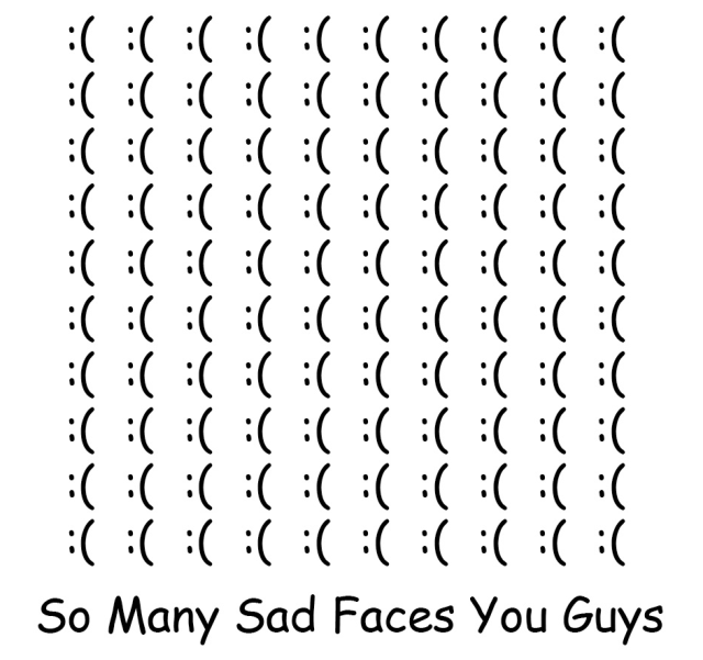
If you look at it a little differently there are one hundred happy faces smiling at you in Comic Sans.
But now, Comic Sans is coming back. Why? Give something enough time and it becomes just ironic enough. It’s kind of why we all started wearing jeggings again. When I was in fifth grade everyone laughed at me because my pants were either always light blue jeggings or dark blue jeggings. Little did they know I was actually ten years ahead of fashion (I’m still waiting on my sweater-turtleneck-jean-vest combos to come back, honestly).
Enter the Comic Sans Project. The Project is put together by a group of “Comic Sans defenders.” In their words: “We fear no fonts and we will make the whole world Comic Sans.” Yeah, it’s kind of … cult-like. But the purpose of the website is to re-design current icons and logos using Comic San, from the Burger King logo to Atari to H&M. Does the world look better with this much Comic Sans? Probably not. Is the world a better place because of this much Comic Sans? No, I don’t think so. But I’m sure you can appreciate the Comic Sans Project enough to let it satisfy your ironic hipster heart — seeing this much Comic Sans in one place is likely to delight that little gothic-poetry-writing ten-year-old you (by that I mean I) used to be.
Some of the my favorite redesigns are below — go to the Comic Sans Project website to Comic Sans-ify your life.

I want a Louis Vuitton bag in Comic Sans JK I am actually poor. via http://comicsansproject.tumblr.com/

Makes the first three movies in the series better, Comic Sans can. via http://comicsansproject.tumblr.com/
It's so much more appetizing when I feel like I'm stuck in the '90s. via http://comicsansproject.tumblr.com/
Just say no.
I can’t help but love this. (Maybe it proves what a hipster I am.)
“it’s much more appetizing when i feel like i’m stuck in the 90s”
omg yes.
i made a lot of tri-fold pamphlets in comic sans. so many.
Comic Sans was the official font of the short lived zine I used to publish in 96.
I literally cringed away from the screen. The only way this could be worse would be if a splinter group broke off promoting the wonderfulness of Papyrus.
Ah, a fellow flincher.
Also, could I get an amen for the general awfulness that is Lucida Handwriting?
Once, I had a job interview that I was very nervous about. But then, before the interview, I received a document from them that was written in BOTH Comic Sans AND Papyrus.
I KID YOU NOT
I was wondering if someone would comment on the fact that Papyrus usurped the Comic Sans throne years ago… Glad to know I am not alone in my nerdy observations.
This makes me want to re-watch “Helvetica”
Though ComicSans isn’t the most visually stimulating, I just can’t hate on a font.
OMG I want to “plus” this fifteen thousand times.
GOOD CALL ON THE PAPYRUS
I SMELL A REDESIGN
WAIT was it this year that for april fools day we made the entire site in comic sans, or was that last year, one of the years we made the entire site a rainbow banner
Stop showing up poor A;ex! Girls tries her best, ya know?
Intern Grace is a genius.
This is the greatest thing I’ve seen all day.
http://www.mcsweeneys.net/articles/im-comic-sans-asshole
you guys have seen this right??? soooo funny!!! best comic sans post of all time
“Need to soften the blow of a harsh message about restroom etiquette? SLAM. There I am.” Perfect.
This makes me wish I had written this whole post in Comic Sans.
loved that piece SO MUCH.
I feel like if I admit to hating Comic Sans, I’m admitting to being old (at the ancient age of 22). It’d be like admitting to not watching Spongebob Squarepants reruns anymore. Or tuning into PBS for Masterpiece Theater instead of Sesame Street. It’s a part of my childhood that I’m still pretending to still like.
So, stop the Comic Sans hate. It’s totally awesome :-\
COMIC SAAAAAAAAAAAAAANS!!
http://www.explosm.net/comics/2301/
One of my co-workers uses Comic Sans on all of her spreadsheets. Not for irony.
Comic Sans is where I draw the line between funny / insulting to all of humanity.
haha katie amazing monologue/article.
i had a math teacher in 11th grade who used comic sans for all her tests and worksheets, it drove me c r a z y
same, but for eighth grade math. it was especially cruel when the tests were hard. trying to hide behind that childish font.
Mrs strong?
A store I almost worked at used Comic Sans for their employee handbook and almost all of the signs in the store. I was kind of relieved they didn’t end up having space for me, even though I really needed a job.
Typeface snob and proud.
If I could kill it with fire, I would.
Word.
Even though we use the words interchangeably now, Comic Sans is technically a typeface, not font. “Font” refers to the physical object, a collection of moveable pieces of lead type (like the protagonist of Stone Butch Blues sets in her first factory job). Typeface refers to the style of the font (ie Helvetica or Comic Sans). Totally irrelevant now that we have computers, but still letterpress machinery is really cool: http://www.youtube.com/watch?v=jxwRlQib1EQ
That was the most simultaneously graphic-design-nerdy and queer-culture-nerdy post I have ever read. I am in awe.
Thanks. Oops, I guess I should have wrote “hir first job”… Sorry Leslie Feinberg, you’re really awesome.
My friend is a letterpress artist (catlorestar.etsy.com) and letterpress is totally awesome. Also, this post.
Did anyone else go to the Comic Sans Project website and start thinking that it looked normal after scrolling down for about 30 seconds?
I must be back in middle school, creating an informational pamphlet about PCP. That’s the only reason Comic Sans would start to look normal again.
Okay, so I don’t want to defend Comic Sans, because I hate it. But last year I taught preschool, and realized it is the ONLY font where the “a” is how we teach kids to write it. And since we were supposed to label everything so that the kids would learn sight reading, I used only Comic Sans in my classroom. I would print sheets with names on the top, and lines for them to practice writing it, and the one time I printed in something other than Comic Sans, poor Ariana looked at me and was like “Miss Caitlin, what are these letters???”
So Comic Sans is okay…only in preschool
You teach kids to write like Comic Sans?
THIS IS WHY THE WORLD IS DOOMED.
I know. That sounds terrible. But think about the way you’re taught to write lowecase letters. No one writes the letter “a” in preschool the way it is in most fonts or types. Comic Sans, sadly, is the closest thing to how kids learning to write with crayons write.
I eventually gave up, and just wrote things myself, and photocopied things if that makes it better.
Why is it that we do this to kids? I have to change how I write when I write on a board for kids, because I use type a’s and they don’t know them. See also, we all used x for “times” in math, and then suddenly you hit algebra and x is an unknown and a dot is “times”. WTF, mate?
I remember being confused and slightly frustrated by the fact that little As didn’t look like the ones my teacher had taught me to make, so I’m gonna say good call on that one.
i feel validated. thank you!!
yeah I would use Comic Sans or Lucida Handwriting for that reason too.
BACK IN THE DAY when I was learning how to write my letters they taught me to write an a that looks like this a <-
Kids these days…
i just remember that they tried to get me to use a “pencil grip” to fix the fact that i fisted all my pencils
fisted.
ggaahhhh no I can’t study Graphic Design and then read something like this. That google thing is hilarious, though.
Jeggings, on the other hand, are AMAZING. As one of my friends put it, women’s fashion is getting better when there are comfortable skinny jeans (“What’s next, comfortable heels?”). Jeggings: a lifestyle choice.
Comic sans is rude.
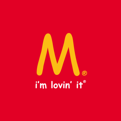
Does anyone else find that the McDonald’s logo looks kind of, um, threatening in Comic Sans? It looks like Satan’s eyebrows.
PS, if you want to meta-nerd on fonts/typefaces, you can listen to a podcast of an NPR show all about fonts. Because, you know, you like to layer your nerdiness. (I highly recommend this podcast in general, BTW)
http://ttbook.org/book/fonts
Is this where I admit that my essays in elementary school were always submitted in comic sans?
Yes because I did the same thing too.
Get off my lawn, you kids! You mean you didn’t write them with a pen? In elementary school? Wow.
What’s a pen?
helvetica for life!!
I can’t help it, all those logos re-done in comic sans just make me reflexively recoil in horror
Agreed.
As a designer, this news makes me worried.
i don’t know whether to laugh at the irony, or to cringe in terror. sometimes i cringe automatically at the sight of comic sans without thinking WHY. comic sans, you cheerful little bastard, you.
i don’t know about you, but comic sans makes me want to reinstall windows 95/98 on an old computer that’s been just hanging around. NOSTALGIA FOR DAYS~~ (i realize that the latest version of microsoft word still has comic sans but, well, still)
I like comic sans, but then, I’m a primary school teacher.
This font would do well advertising anxiety. It has the level of uneasiness much like the feeling a puppy has when it gets taken away from its mother. Bastardizing these logos is a cruel, cruel joke.
I’m pretty sure someone who worked at my organization must be a part of this project. I opened the office contact list to update it, and what do I see? Comic Sans, in all its glory. Comic Sans, everywhere. Comic Sans, haunting my dreams tonight.
Hahahahaha…ha. I would love a Louis Vuitton bag in Comic Sans…just as an expensive form of irony.
Comic Sans forever entered the history of typography as the worst from the point of view of professionals. But the best from the point of view of the inhabitants) It is good that today for the inhabitants there are many toys, for example https://exoticfonts.com/
These are fonts that do not need to be installed to use