

 Header by Rory Midhani, Feature image by Dear Data
Last week, last.fm — the semi social network that tracks user’s music listening activity — relaunched its website and minorly inconvenienced my mid-afternoon. I’ve been an active member since 2006 and find the service to be deeply soothing to my inner data nerd. Through their automated “charts” feature, I could immediately see, for example, exactly how many times I listened to “Living Room” by Tegan and Sara on repeat in September 2006. (Now, that data will never tell me why I then included the stalker-y lesbian tune on a much agonized over mix cd for the boy I wanted to date, but hey. To fully plumb the depths of my heart requires more than a single bar graph.) Anyway, that and many of the third party tools using last.fm’s API are currently broken, and I’m full of regret that a) I didn’t finish making my “Songs I loved in 2011” playlist, and b) I didn’t take advantage of the many interesting data visualization tools that used to work.
Supposedly last.fm’s full functionality will be restored at some point, but I’m not holding my breath. I have, however, been looking for alternate services and generally perusing the web for nifty data visualizations. Here are a few I’ve been digging on lately.
1. Equaldex
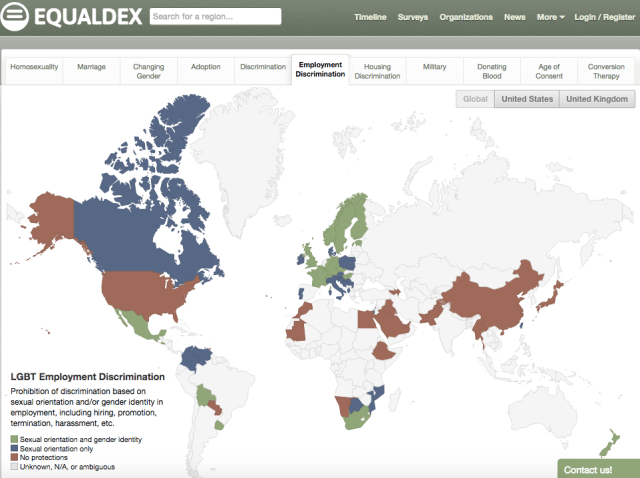
Equaldex is a collaborative knowledge base aiming to “crowdsource every law related to LGBT rights to provide a comprehensive and global view of the LGBT rights movement.” It tracks the status of various legal protections around the world, giving you a color coded map for easy browsing. We talked about it when it launched last year.
The data is largely presented as is, without overt editorialization beyond the initial choice of which metrics to include. So I’m going to editorialize a bit here by suggesting that you look at all the tabs (because they tell different stories), and keep historical context in mind when drawing conclusions. As Helen has written, “It is important to defend human rights and to speak out against human rights violations around the world. However, the West, in its attempts to endorse freedom across the globe, has invoked — once again — the White Savior trope that ignores and erases any Western culpability in anti-LGBTQ policies that occur in other parts of the world, especially in the Afro-Diaspora. To talk about anti-gay legislation internationally, we need to talk about a history of white supremacy that brought homophobia and anti-LGBTQ legislation to various countries.”
2. Dear Data
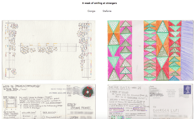
This project is the coolest thing! Dear Data is a year-long, analog data drawing project created by two penpals: Stefanie Posavec, an American living in London; and Giorgia Lupi, an Italian living in New York. Each week they pick a theme and track data in their lives relating to that theme. They then create visual representations on postcards and exchange them via snail mail.
I love the postcards they make, but the words they write to explain them on the internet are absolutely gorgeous too. For the most recent entry (Week 37: A week of swearing), Stefanie wrote,
I am a lover of words, and this means I am definitely a lover of swear words. I love the hard cracking sounds a swear word makes in my mouth, and how they have a particular physicality as you say them, shattering the air like a hammer. So, as I’m sure you can imagine, I was incredibly-excited for this week of data-gathering to commence. This week of swearing wasn’t meant to be performative, but I may have made it more of a performative week because I used this excuse of data-gathering as free reign to swear whenever and wherever I wanted, savouring every time a swear word left my mouth.
So lovely!
3. Google Trends: Election 2016
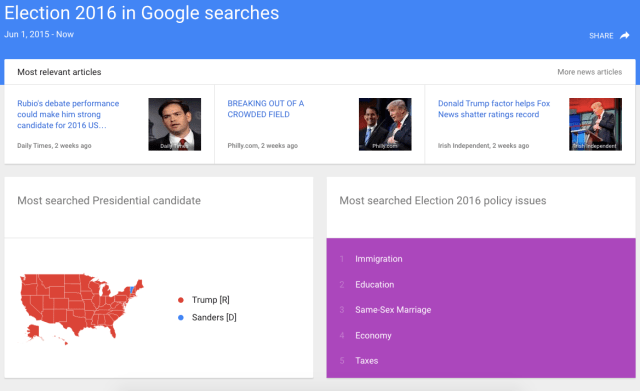
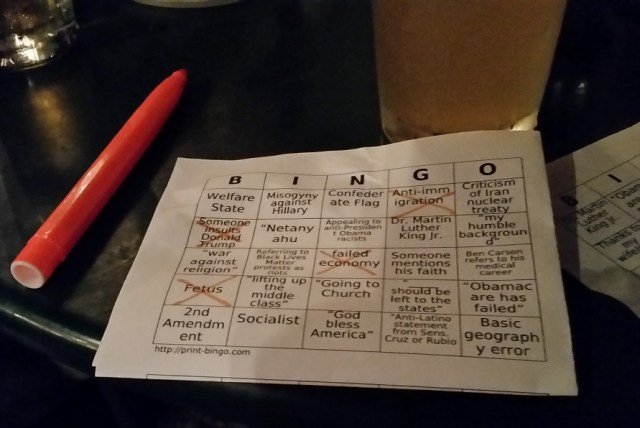
It’s presidential election season in the United States, meaning political news reaches new heights of loathsome ridiculousness on a daily basis. I watched the first GOP debate at a queer-ish bar where we played BINGO using cards designed, I presume, to lightheartedly highlight the absurdity of what was unfolding before our eyes. I won a box of Red Hots that night, but I’d gladly turn it back in if I could give the American political machine some scrap of its dignity back.
Regardless, I’ve greatly enjoyed watching what the internet at large is Googling about the candidates. At the time I wrote this article, the burning questions on everyone’s mind include the height of each of the candidates, “Is Rand Paul Ron Paul’s son?” and “Will Hillary go to jail?” (Yes and no, respectively.)
4. New York Times: Mapping Segregation
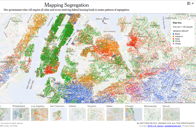
Did half a dozen people send this to you already? Just me? Well in case you haven’t seen it yet, this New York Times visualization accompanied a July 8 article about the Obama administration’s stricter rules against segregation in housing, and it does a fantastic job of highlighting the issue.
Racial segregation is (still) such a real thing. Seven weeks ago I was looking for a new place to live in NYC, and I came up against this issue in seemingly every neighborhood I looked at – most strikingly in Bed-Stuy, where I watched 30 white cops arrest a Black man in front of his own home for trespassing, no doubt the result of a new neighborhood transplant calling in. Much as I want to attribute this to New York City being the headquarters of human grimness and malfeasance, a look at the data shows that this is not the case. It’s awful everywhere.
5. Washington Post: The mathematically proven winning strategy for 14 of the most popular games
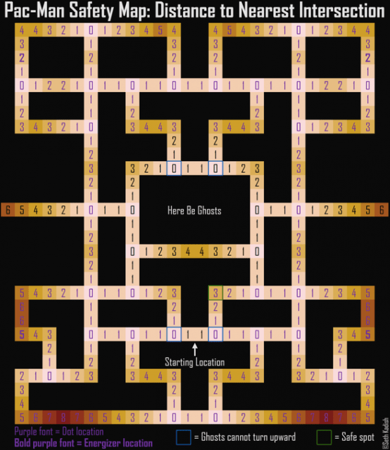
This Washington Post article on how to win at games was written in May, but I just found it now. It includes Battleship, chess, coin tosses, Connect Four, Diplomacy, Jeopardy, Monopoly, Pac-Man, The Price is Right, rock-paper-scissors, Scrabble, Texas hold ’em, tic-tac-toe, and general tips for winning in Vegas.
My favorite is the tic-tac-toe entry, by Randall Munroe of xkcd. The amount of time and effort it took to make this is immediately apparent by the level of detail that the graphic goes into. It’s super nerdy. (And yes, I mean that as a compliment of the highest order.)
Notes From A Queer Engineer is a recurring column with an expected periodicity of 14 days. The subject matter may not be explicitly queer, but the industrial engineer writing it sure is. This is a peek at the notes she’s been doodling in the margins.


Comments
Dear Data is *AMAZING*!!! Thank you for sharing this!!
Yes! Such a cool project.
these are so EXCITING, Laura! I’ll probably waste the rest of my afternoon prying into every one of these.
You are in for a great afternoon.
I just wanna say, the geekery on the site recently has been A PLUS PLUS PLUS. (100 emoji)
like. would enjoy more.
!!! I love graphs and charts and also xkcd. Be still my nerdy heart.
…I think it’s a little disturbing that Trump is the most widely searched candidate in all but one state though.
It is also disturbing that “homosexual activity” apparently only became legal in Montana in 2013. 2013?!? Did I read that right?
That Equaldex site is great though!
He’s just so… much. I’ve probably done the most searches on him too, just to try and understand what’s happening.
whoaaaaa
that segregation map is so good and interesting!
ahhhhh i love this so much i’m overwhelmed by how much i love this. maybe i should make a graph about it
I feel like in this case, graphs might be one step away from Zines?
I love graph-zines!
So much data love! beauty and power
The quickest way to my heart is through data visualization
Also I’m working on some data viz for last.fm, I’ll let you know when those are up
Ooooh. Please do!
The Pac Man visualisation map was great but I’m afraid nothing can save me from my terrible Pac Man technique….